Monday, April 30, 2012

Melancholy Ballerina

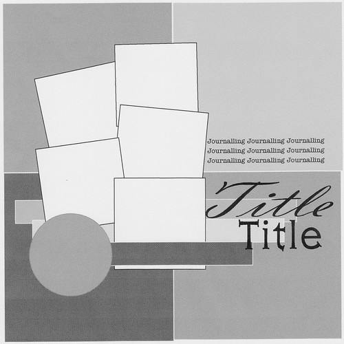
Good Morning! I am so excited to be able to play along with the Authentique sketch for April. It was such and original design.
I decided to get out my Gathering line and with it's oranges, aquas and browns..it seemed a perfect fit for this gentle sepia photo of Adriane.


I began by fussy cutting the 'together' paper and laying it out in a diagonal across the design. I then used the other supporting patttersn and cut penants from them. I added a few Authentique words and stitched them in place.


I layered the photo on the 'flourish' paper and rounded the corners. I used some aqua floss and layered a few stitches in random spots then added some flowers in a cluster. The ribbon is attached with two sided tape and pleated.

The journalling speaks about how tired and sad she was at the end of her very first recital, but she braved it all and did her very best. I really believe it is important to scrapbook all facets of life and this was one I wanted her to remember forever.

Thank you Authentique for a great sketch! Looking forward to the next one! Until next time, keep doing what you love!
Christa

Thursday, April 26, 2012

You Had Me At Hello

 I created this design about my darling, handsome puppy, Bo. I have had this photo for quite sometime and when I saw this little rub-on with that old Jerry McGuire quote: "You had me at Hello", I knew just what I was going to do!

I had purchased some smaller templates at Scrapfest from Balzer designs. This sunburst pattern was great to use with a few layers of water colour paint. I then used a sketch from Let's Get Sketchy to fill in the rest of the project. Some layers of scraps (Stampin Up!, Jillybean Soup and My Mind's Eye) together with some bottle caps, stitching, and a few bits and pieces of black/kraft card stock. I added some ink to a chipboard heart and then added some glass bead medium for texture.

This title uses some Thickers but also my Dymo labeller and a font (LD Susie) from my Silhouette.

I think this design suits my darling Bo-Bo perfectly and I am happy with the results! Until next time, keep doing what you love!
Christa

Tuesday, April 24, 2012

Momenta and Paper Bead Bracelets

Good day! In honour of Earth Day this past Sunday, I wanted to share with a craft that uses up all those paper scraps you have lying around. While at a scrapbooking convention near me, my pals at ScrapMuch? showed us how to make these really cute paper beads and the resulting bracelets. When I saw them I knew right away that the Super Pad paper was a perfect texture and the bright colours would create stunning beads.
Here's a quick peek at the finished product:


Here's what you'll need to begin:

1. Plastic Drinking Straws.
2. Scraps of paper, I used the Super Pad and the scraps should be 12 inches in length.
3. Stretchy cord for beading.
4. Beads of any kind and size to compliment your paper scrap choices. (I also added a twist closure).
5. Some fast drying glue (I like Beacon's 3-in-1).
6. Scissors and a paper trimmer.

Step 1:
Cut your paper strips in a 12x12 length. They should be slightly narrower at one end than the other and look like this:

Step 2:
Begin by adding glue to the thick end of the strip. Wrap the paper around the straw.

 Step 3:
Continue rolling the paper tightly around the straw and glue the very end. Continue with each strip until you have enough beads.


Step 4: Once the ends are dry cut the straw into beads.
Step 5: Begin layering the beads for your bracelet on the stretchy cord. Try to estimate the size of of your bracelet and leave enough to tie the ends according to the cord's manufacturing directions.
The Super Pad has great patterns and colour combinations to choose from. My daughter and I made several combinations.


I hope you'll give this a try! It's super easy and the results are surprisingly fashionable. I have a few I wear everywhere and I am always asked where I got them!

Until next time, keep doing what you love!
Christa

Sunday, April 22, 2012

Watercolour Musings with Two Scrapbook Friends (Part 1)

Good morning friends! Today for our Friendzy Friday at Two Scrapbook Friends, (I am a bit late putting it up here!)  I wanted to share with you a product that I use all the time on my scrapbooking pages : Watercolour Paints. Now, I want to begin with a very big disclaimer: I am not an expert on watercolour paints! But I can tell you what works for me and how I achieve the techniques you may have seen on my pages or cards. Ready?

To begin, let me share with you some of the products and tools I use:


1. I chose some good quality watercolours with lots of shade options. (As you can see, my watercolours are hard loved and some of the favourite shades are fast disappearing!)
2. I have a small selection of very reasonably priced paint brushes in different bristle types (more on that later!)
3. Paper towels for blotting and to act as an absorbent mat under my art work.
4. A basin of water (change this often as your light colours will show the taint of blackened paint water)
5. (optional) A fixative which I like to use if I am giving the card away or if there is alot of paint on the design. This helps fix the paint to the design.

Quality!
When acquiring paint and brushes I tend to look for quality like I do any other scrapbooking supply I am going to put into my scrapbooks. The colours from good paint are truer, allowing you to better blend colours to match a patterned paper or predict their shade with more accuracy. The brushes that are good quality will not shed their bristles in the middle of your design and will not separate while in use. Ask at Two Scrapbook Friends for information on good quality paints and brushes to order.

Paper
There is special watercolour paper available but it is fibrous and heavy and not always acid free. I use plain cardstock every time, but it can be known to warp a bit with drying and the more water you use. Washes especially will cause regular paper to warp. I recommend experimenting to find the effect you love too.

Brushes
When choosing a selection of brushes I wanted a variety but without breaking the bank on costs. Here are the four brushes I have selected:


a) a wide very soft bristle brush to create washes of colour.
b) medium sizes square bristle brush for very defined strokes.
c) a smaller square bristle brush to create smaller defined strokes.
d) a firm bristled finer tipped brush for all the other painting I might need!

Cautionary Tales of Things to Know Before You Begin

Watercolour can be made more or less intense by adding more or less water. I recommend experimenting before you begin; especially if you are concerned about the end result. If you are a go-with-the-watercolour-flow kinda gal, the have it and art will out! The latter is my path these days and sometimes you can be surprised.

All of my techniques require you to have a protected work surface or area away from items that could become ruined in the process. I cannot stress this enough. Watercolour paint does not come off photos even though it can be wiped off surfaces if you act quickly. Follow manufacturer instructions for care and safety.


My Favourite Technique

Splatter
One of my most favourite techniques is the splatter effect. Almost all my designs carry this distinctive splatter. The bright watercolours can be translucent but also make a nice round droplet on the page.

In order to do this, I first choose my colours that I want to work with that bring out the design or match the pattern paper. Something to note, you can custom blend shades to match your papers (see Our Family below) by adding tiny tiny amounts of colour to your primary shades.

After laying out the other elements of my design, I can see where on the background I will put my splatters. I remove the elements of the design to a safe zone away from the paint. This is very important!

I then apply water and the desired paint to the smaller square ended bristle brush. This allows me more control of the AMOUNT of paint & water on the brush and the size and direction of the splatter. I often test the colour and intensity on my paper towel. (LESS water will mean a more intense colour and smaller droplets.)

To make a splatter I gentle tap the brush in the direction I want the colour to go. I begin gently, it is easier to add more than it is to take away!

Being sure your design is flat, begin with the darker colour and layer the medium and lightest components on last. DO NOT pick up your design or some of the droplets will run (unless of course that is your intention for design!) Since I am not a fan of dry time, I use my heat tool to speed the process along.

Dark:

Medium:

Light:


Here are some examples of work where I used the splatter technique.

This design uses a rainbow of colours to reflect the raindrops of colour Grandma brings into our life!

I used custom made colours in navy and olive for use with Our Family and the Authentique Loyal line.


I will post the additional parts of this Watercolour Musing over my next few Friendzy Fridays. Be sure to check back (in May and June) and see what else I can cover in this fantastical crafty medium. In the meantime, if you have questions you can contact me at the Two Scrapbook Friends forum!

Until next time, keep doing what you love to do!
Christa


Friday, April 20, 2012

Blog Hopping With PSA Esssentials and Momenta


Good Morning to the PSA Essentials and Momenta blog hop! I am thrilled you decided to join us to see the amazing creations our teams have put together to inspire you!

Here's the rules, regulations and ways you can WIN from both PSA and Momenta. PSA is awarding one lucky blogger a prize including: 2 Peel & Stick stamp sets & 1 PSA Stamper (MSRP - $55) and
Momenta is giving away a Vacation Prize pack (MSRP - $35)!

1. The hop will run until 11:59 pm Saturday, April 21.
2. You must leave a comment on ALL the blogs in order to be entered to win.
3. Have fun!

You should have come to me from Kazan's blog and afterwards be sure to head over to PSA's Stamp Camp blog.

As you know, PSA has a great innovative stamper that takes the mystery out of lining up their awesome two part stamps or getting the right amount of ink on your stamp. I love using their little sheep stamp on my layout of Adriane when she was just a little little girl!


I used this great paper from Momenta and used some machine stitching as a frame around my set of photos.  I used three fonts and two little sheep to accent my title work.


There are some little sprays of watercolour paints to match my paper colours too. I coloured my little sheep with my markers and blender pens. Not Copic girl, but these stamps need little colour to make them stand out!
Thanks for hopping along with us today! I hope you are enjoying the end of your week! Please stop in again and keep doing what you love!
Christa

Supplies:

PSA Essentials Stamper and Sheep Stamp

Momenta PK 2146 BAS 12x12 Pad
Momenta Pink/Yellow Puffy Letters

Other Supplies:
Basic Grey Brown Letters
American Crafts White Letters
Tim Holts Ink
Stampin Up Markers and Blender Pen


Monday, April 9, 2012

Ticket to Ride

Good Morning! Today is Crafty Challenge day at Two Scrapbook Friends. I adore the days when I get to be the issuer of a challenge and to inspire my crafty friends to create a card or layout. Today`s challenge is to use tickets on your design.

I used Echo Park`s Boy`s Life to create this back to school design for Adriane`s return to Grade Three. I had saved these bright yellow tickets from an event my hubby and I attended and they worked perfectly!


I like to work on white a lot (as you may notice) and I have been loving the effect of splattering my watercolours. Watercolours dry quickly and with the help of the heat tool, there is little or no wait time.

Using my Silhouette, I cut various file folder tabs from the patterned paper. I layered them under the photo which had been 5x7. I narrowed the photo so it fit in the design better; don`t be afraid to do that if something just isn`t working.. I took a page out of my BFF Ann`s book and cut several fonts for my longer title. The big number three is also cut with the Silhouette and tied with Twinery Twine. After adding some strips to anchor the design I stitched and added the tickets. The apple is from Simple Stories and adds that last little bit of school related charm.
I liked how this turned out and I hope it has inspired you to create your own designs featuring TICKETS. Please stop by our gallery and forum to play along and see what everyone has created!

Until next time, keep doing what you love to do!
Christa

Momenta's Chloe's Garden: Two Different Designs

Being on Momenta's design team allows me the luxury of great product and the chance to share with you my creative process and results! This month I focused on Chloe's Garden and I must confess that I had planned one great layout (my first love when it comes to crafty designs). But have you ever had a line of paper and used every little bit? Well that happened to me with Chole's Garden! I created..and created...

First one design..
Then ANOTHER...
In the end, I couldn't decide which to share and which to hold back..so I thought I'd share both!

My first design features photos of my daughter at the beach. The blues and pinks really high light her suit and that blue Caribbean sea.

After printing my photos, I chose several patterns from the Chloe's Garden Pyramid pack. This paper is TWO sided and TEXTURED! Two things I adore about paper and when I choose to create these are things I take into account. I tore strips from each piece and layered them down the page.

My second design, was inspired by all the star burst patterns I am seeing out in the world. Lots of inspiration in art, scrapbooking and even paper design, feature the star burst pattern. Not sure what I mean? Here's a design I made featuring a photo of my daughter in the very early spring. Here in Ontario, Canada, spring can begin cold..we have a saying: In like a LION out like a LAMB. That spring sure came in like a lion! My daughter's nose is pink and her cheeks are rosy.


I mounted the photo on white and and grey and to let it stand out from the patterned background. I then used some co-ordinating pink and blue to create some accordion flowers for accents. The star burst pattern is created by cutting long triangles of paper in arranging them in a pattern around the page.

Both of these designs and their instructions can be found at My Momenta.

I hope you can see why it was hard for me to choose one of these designs. Do you have a favourite? Let me know which one you like best!

Until then, keep doing what you love to do!
Christa

Momenta Supplies:
Chloe's Garden Pyramid Pad  (PA-2384 )
Chloe's Garden Puffy Message Stickers (ST-4909)
Vibrant Puffy Alpha (ST-2557)
Mini Clear Layered - CHG (ST-4843)

Other Supplies:
Cardstock is Bazzil
Butterfly Punch is Martha Stewart
Twinery Twine
Rose trim is unknown

Wednesday, April 4, 2012

Sketchy Challenge with Two Scrapbook Friends

Good Morning friends! Spring is here and there's nothing like great weather to get your creativity flowing. Today, I want to share with you a design I made for our Sketchy Challenge in the forum. It uses some little photos and larger pieces of patterned paper.


Here is the design that I used to create the sketch!


I used American Crafts Dear Lizzy line to create this design and my Silhouette to make the ice cream cone. The delicate colours of this line are perfect for any photos you may have waiting to scrapbook! The titles are also from my Silhouette! Did you know TSF is a dealer of the Silhouette and all it's accessories? The new Cameo is AMAZING.


I hope you'll stop by the forum for more details about how I designed this layout and sketch and even upload YOUR creation to the gallery and forum.

Until next time, keep doing what you love to do.
Christa

Monday, April 2, 2012

Lipstick Chicks are doing some heavy LIFTING!

Good morning fellow scrappers! This month at the True XOXO challenge blog we are doing some heavy lifting! Scraplifting, that is! We were challenge to choose a design from the blogs of our fellow designers and lift it for your inspiration this month! What a MAMMOTH task. I kid you not! Sooooo much scrappy goodness, I got lost in blog-ville!

Finally I chose a design from Emma Fronda called "STREET ART". This design had so many elements I wanted to use in my own design.

I chose to mimic the large circle element and the scalloped tag. Where Emma's design is more expansive than mine, I did want to reflect the cluster portions and the 'splatter' effect. Even though my splatter is done bythe pattterned paper design!. I also distressed (you can't see it very well due to photo editing) the outside edges of the design to mimic the scalloped edge on Emma's. There are lots of other little things. Can you see them?

I also wanted to share with you the amazing contest going on at XOXO blog. Since we have moved, we need a new blog header! Lindsey (our guru) has decided to let YOU design one for us! Be sure to go to the new blog here, to find out all the deets.

Until next time, keep doing what you love to do!
Christa


Supplies:
Momenta Vacation Pyramid Pack (PA-2389)
Momenta Primary Star Stickers (ST-3270)
Momenta Celebrate Puffy Message (ST-1765)
Momenta Fun Letter Sticker in Brown (ST-5831)
Studio Calico Wooden Star
Twinery Twine
Harmonie Chipboard Circle
American Crafts Tag
Basic Grey Photo Tab
Fancy Pants Orange Chipboard Letters
Martha Stewart Punch