Friday, March 30, 2012

Our Family

I want to share with you a layout I made using the Authentique Loyal Line. It seemed fitting that I should choose this Loyal line to document a photo of my family taken by the comparable Angela Smith of Waterloo. I is a favourite of mine and in fact hangs in 18x24 glory on the wall of my kitchen.

I was inspired to use the sketch posted at Authentique as well. Their sketches give a great starting place that really gets my creativity flowing. Altogether, I felt I had a creative place to start!

I fussy cut the large flower out of patterned paper and then two more smaller ones and layered them for depth. The flourish is from a Tim Holtz die. I felt, that like our family the design should have lots of textures; feeling to the eye. I added the corrugated letters from Pebbles and the stitching for two extra textures. I also used the tiny navy words. Can I tell you that I love these words? I look for any opportunity to use them!

I hope you are inspired by this design and I encourage you to head over to Authentique for more inspiring designs, sketches and even a few laughs. The Loyal line is Authentique's usual high quality and great design! Drop me a line and let me see what you've made with Loyal.
Until next time, keep doing what you love to do!

Sunday, March 18, 2012

Whenever

Good Morning, fellow scrappers! Today, I want to share with you a design I made about my darling daughter. It was inspired by a Basic Grey sketch based on a layout by Leeann Pearce.  I love to use Basic Grey because it stretches my creativity and I find that I fall in love with the end result. This design was no different.

I used the Sweet Threads line and added some watercolour paints. I also added a canvas circle which I enhanced with ink and Luminere paint. I tried to add texture with machine stitching, velvet ribbon and luminescent rosettes.

Finally, the little banner on pennants is also glazed with Luminere and ink. The title is inked and sanded too.
I really tried to focus the colours and design around the two smaller photos. I love working in these odd sizes of photo.  I hope you'll give this a try too! Thanks to Basic Grey and Leeanne for an inspiring sketch!
Until next time, keep doing what you love to do.
Christa

Saturday, March 17, 2012

Friendzy Friday: Pretty Dressform

Good Morning! Today on Friendzy Friday, I want to share with you a pretty chipboard dress form.You can add them to your cards or layouts and they add dimension and texture and can be the "wow" you are looking for!

To make this card you will need the following:

Fast Drying glue
Trimmer
Distress Ink and tool
Trim
Needle and Thread
Border punch
Maya Road Chipboard Dress Form
An 8 inch piece of patterned paper
A scrap of matching paper for the top


Step 1:

I used my trimmer to cut a 1 inch strip and border punched along the edge.
I used two matching patterns of paper here.


Step 2.
Once I punched the strips I began folding them accordion-style.
Step 3:
I used my paper piercer to put holes in the
accordion pieces.
Step 4:
This makes it easier to thread the needle through the holes and create
the fan shape required for the skirt. I do this on each piece.

Step 5:
I then inked the dress form chipboard.

Step 6:
I added glue and attached the pleated fan shape. You will have to hold the pleats on quite firmly

Step 7:
I traced the shape of the bodice on the plain cream paper. And glued it on.

Step 8:
Trace the upper part of the dress form on a plain or matching piece of cardstock.
Cut it out and adhere it to the dress form.


Step 9:
Using a small piece of ribbon, fold and sew it to create a blossom.

Step 10:
Glue the sleeves on in the appropriate location.

Step 11:
Add bling or adornment as you like.


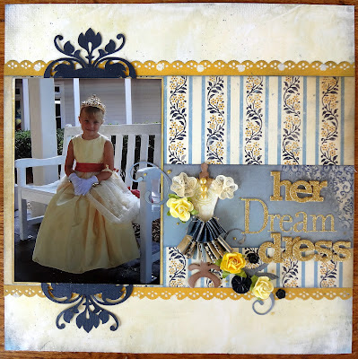
I made a dress form similar to this one for a layout featuring my daughter's elegant Princess dress.

I hope you'll give this feminine embellishment a try!
Until next time, keep doing what you love to do!
Christa

Thursday, March 15, 2012

A Little Bit of My Mind's Eye Goodness

I can't remember when I have enjoyed a CHA release more than this past Spring. In fact, several of my favourite releases came from My Mind's Eye. Two Scrapbook Friends, my dearly beloved local Scrapbook Store received their shipment and I was all over it! In fact, I was so enthusiastic about it they let me have it for my Design Team kit! I love those TSF girls!

The first design I created is called Just Like You. It is about a beautiful photo that Angela Smith of Waterloo took. It features a smiling photo of my son and some sweet little daisies.The photo is special because those flowers were growing in rough terrain. They were surviving hardships and yet, were a beautiful part of life. It reminded me of some of the hardships my Max endures in life; that he grows tall and strong and beautiful.
.
Most of you, who know me well, know I am not a big fan of FLOWERS for flower's sake and I really don't like them very often on masculine pages. I am a big believer in "meaning' in our embellishments. So when my BFF Ann saw this lone daisy, she said right away: "A Flower?" but being the BFF she is, she got the meaning of that lone daisy.   I should confess that I did try OTHER embellishments but the flower worked out the best. I also used a sketch from my pal, Laura Whitaker.
The next design is of my sleeping dolly when she was such a little girl. Still had her blankie and her 'tootie'.
I decided on a centralized design and a layering of the great patterns of this line.
The little letters are Momenta and are raised and sort of puffy. I love this size! The buttons are CTMH and the swirl is cut by my Silhouette. Did you hear? Two Scrapbook Friends are carrying the CAMEO Silhouette and all the accessories!
Finally a few cards, using this line :
This card is made using circles! I just rolled them gently on my knee with a pencil until they took this shape!

Some great strips again with some zigzag stitches.
This final card features a rose from Prima with nice chunky glitter. You can actually make the roses for yourself and I will be doing a brief tutorial in the very near future!

I hope you'll invest in some My Mind's Eye from Two Scrapbook Friends...I still have lots of product left over and already have plans for it!
Until next time, keep doing what you love to do!
Christa

Tuesday, March 13, 2012

Guest Designer at We Scrap and a Little Vacation Memory

I mentioned earlier that I was lucky enough to be a Guest designer at We Scrap. We Scrap has great monthly kits filled with lots of surprises and great papers. I used my kit to create some really great designs.

Here's one I made of Adriane and Max. I love these great Thickers and the little tiny clothespins!


This little design of my daughter and her two ballerina buddies many years ago, deserved some accordion flowers, some bling and a flourish or two.

I also used the kit to make this design about my husband and his family. They have such love for each other and it really shows. They are so happy in their lives. I chose a really large title and the four smaller pictures. The stitching is red and the extra paint splatters add visual interest, don't you think?
Finally I used the tissue tape in the kit to make a few cards. The word stickers from Authentique made it so easy to find sentiments that suit.

This last card I used up some of the little pieces and I loved how the diagonal lines, chevrons and text go together.
I hope you'll check out Sabrina's and Corrine's designs too. It's amazing how much you can create with this kit!
Finally, we just returned from a 8 day vacation to Florida and had the best time! We stayed at the Animal Kingdom Villas right in Disney world. We usually stay on Disney property for many reasons: Magic Express, Extra Magic hours, standard of service and resort themeing are just a few. We usually enjoy their Moderate Resorts and the Free Meal Plan deal when it is offered, but this time we decided to give the Disney Vacation Club resorts a try. My dear friend Lisa, referred us the the The Timeshare Store where we got a great deal on the DVC Resort. I must say, I wouldn't have believed if I hadn't tried it for myself! Jerry was the nicest agent and very helpful. He arranged out 4 night stay there for less than we could have stayed at a VALUE resort on property and the extra room, service and Disney experience was divine. I hope you will check them out, they usually have deals on Resorts and are happy to provide you with a quote at no obligation. Just choose the resort you want to go to (one or two options) and they will let you know the price. I added a meal plan and tickets too, with little fuss.

Here are some pictures of our trip! This first one is Adriane and her friend Lauren. They had a blast playing Kim Possible, which is a MUST DO if you have kids AT ALL!
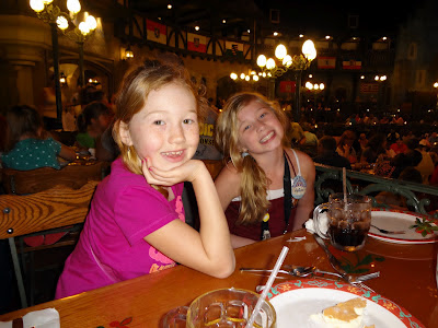
Here they are enjoying lunch at the Biergarten Restaurant which is like a big outdoor (but actually INDOOR) beer garden at Oktoberfest. There is a band and little show too!!

It's nice to see Max and Adriane still get excited when Mickey Mouse stops by our table!

Strangely, on this holiday my hubby was behind the camera and I was in more photos than I would normally like. But this one shows me at Hollywood Studios with the Tower of Terror in behind..not that I rode that sucker!

Finally, photo of the magnificent lobby at Animal Kingdom Lodge Jambo House. We stayed at the smaller Kidani Village but the theme-ing is very similar.

I can hardly wait to return to Disney in September..trying to figure out how to get two weeks in...or ten days? Now that I found out about Direct Air out of Niagara Falls, I think I might be able to go more often...don't tell my hubby!

Until next time, keep doing what you love to do! Thanks so much for stopping by.
Christa

Tuesday, March 6, 2012

I Want To Talk About YOU!

Good day, friends! Today, in our forum we are challenging you to share a layout about YOU. So often we are behind the camera and rarely get designs created about ourselves in these valuable memory albums.
Here's a layout I made about myself using Simple Stories Year-o-graphy line.


I used some water colour paints to alter the white Jilly Bean letters and splatter some matching colour on the white background. Some Twinery twine holds down the banner and to tie a little bow.


 I hope you'll join us in the forum and the gallery with your designs! I'd love to hear all about YOU!

Until next time, keep doing what you love!
Christa
Sunday, March 4, 2012

Summer Son (and a blog hop winner!)

Good day fellow Momenta-lovers! This week, I wanted to share with you a design I made using the Family Outings line . This layout features some photos of my son taken about 10 years ago. Scrapbooking them really brought back memories of him running through the sprinkler and having the time of his life!


There is lots of machine sewing on this one! I especially like the zig zag stitching on the ribbon and under the journaling strips. Stitching is a great way to add depth, contrast and texture!

I sure hop you'll try the Family Outings line (PA-22328 FAO 12x12 Super Paper Pad). It has so many great paterns that inspire.


And for those of you who visited for the Practical Scrappers Link With Love blog hop, the winner of my RAK is Krissy! The very first commenter of the hop! Congrats Krissy and thank to all for your lovely comments.
Until next time, keep doing what you love to do!
Christa

Friday, March 2, 2012

Practical Scrappers Blog Hop is "Linking with Love"

Welcome to the Practical Scrappers "Linking with Love" Blog Hop!  We believe it is important to always give credit when it is due to another crafter.  For this unique hop all of our design team members used the same inspiration piece to create their project.  Each of them will make an example of themselves as to how to properly "Link with Love" and credit the inspiration.  We'll be running the hop thru Noon EST on Sunday - so you have plenty of time to get thru it!

Liz Qualman created this beautiful layout and we have all used it for inspiration.  Each of us will tell what part we took our inspiration from.  The whole hop will culminate at Liz's blog where she'll provide us with a new sketch for inspiration.


Many of the designers are providing prizes at their stop and Practical Scrappers is providing a prize for one person who becomes a follower at each stop (for all the details head over to Practical Scrappers). 
Blog Hop List 
Practical Scrappers
Christine Meyer
Christa Uttley (THIS IS ME!)

Thank you for hopping by! For those of you who know Liz Qualman's sketches you'll know they are both fun to work with and they give you lots of opportunity to be creative. Liz created this wonderful design and I chose elements from it to springboard my own creativity.

 I chose some wonderful new My Mind's Eye paper. I love the wood grain and the orange/aqua palette. I was inspired by Liz's use of butterflies and the three pennant pieces in two locations.  These things create great visual flow across the design and add visual interest.

I also chose to layer the tabs on the upper left under each matted piece rather than place them across the top.


I even added a wooden butterfly that I inked with distress ink and added watercolours. I then added micro beads in orange for lots of texture and a bit of glimmer.

I was also inspired by Liz's use of a tag in the lower left. I wrote a little note to my daughter to let her know how she fills me with wonder every day.


If you are kind enough to leave a comment on my blog and become a follower, I will randomly award a small prize to one lucky hopper.  I thank you for spending your valuable time with me today! Now head off to Audrey's blog to be amazed and inspired!

Until next time, keep doing what you love to do!
Christa