Sunday, April 28, 2013

Root Beer

I think Scrapbooking is about capturing the every day moments as well as the big events like Birthdays, Holidays and vacations. This layout is about one of those moments. The little ones; a tiny little bit of time that I wanted to remember for ever. We were in Florida at a Cracker Barrel (of all places) , just after our visit to the Dali museum. Adriane had ordered a Root Beer in a bottle (which she says always makes her feel grown up) and she then proceeded to act anything BUT grown up. Silly faces, giggles and general tom foolery!

I used Echo Park's SWEET GIRL collection and cut several patterns into strips. With some water colour splatters for dimension and some cute pinwheels by Queen&Co. I tried to capture the silly fun of the moment. The little blue frame from by Studio Calico is a perfect colour match. The package had so many options it was hard to choose.
I used my Silhouette to cut my favourite font Lollihop and covered it in Crystal Effects for shine. A few American Crafts Thickers finished it out perfectly.

This is an amazing collection with so much versatility. The sticker sheet has some vintage elements but also some great borders and words.  You can find more of this collection at Two Scrapbook Friends online store, here.

Until next time, be sure to enjoy all your silly moments, and keep doing what you love.


Friday, April 26, 2013

Up, Up & Away

I wanted to showcase these really cute pictures of my family from October 2012. It's not that often that Max lets me take a really good shot where he's not making goofy teenager-boy faces, so when I do get a few I want to immortalize them in the best way. But they sat around in my photo bin just waiting for inspiration to strike.


It's not often that I get inspired to create from products alone. In fact, usually my photos drive my creative process. But on this rare occasion, I was inspired by Studio Calico's wood veneer travel pack (none of which is shown here!) which has a very cute little jet and the map-like patterned paper from their Here and There Collection brought to mind a globe and..VOLIA the plan was struck!

I found this little jet digital shape on Silhouette and placed them around my globe shape.
 
 It's a simple yet effective design which really expresses movement and the idea of travel.

You can find more of Studio Calico's Here and There and the wood veneer at Two scrapbook Friends online store, here.

Until next time, keep doing what you love to do!

Wednesday, April 24, 2013

Inspiration Elevator Blog Hop Winner

Thanks to all who stopped by to say hello over the past few weeks from our Inspiration Elevator blog hop. The winner of the Echo Park Hello Sumer paper pack is non other than JoAnn Heinbuch.
Congratulations!

Tuesday, April 23, 2013

Go.

During my most recent vacation with Adriane to Florida, we stopped first at my parent's home in Brooksville. It's about 2 hours west of Orlando. We flew into Tampa Bay for the very first time.
This design features Studio Calico's HERE AND THERE collection. It has some great patterns and actually has a artsy feel.


It showcases some small photos of things we enjoyed while on our trip.
1. Sunrise from the plane window at 30,000 feet.
2. The arrivals gate at Tampa Bay airport.
3. Grandma and Poppa's trailer in retirement heaven!
4. The Welcome marker to St. Petersburg, Fl.
5. Adriane enjoying (obsessing) Poppa's scooter.
6. Adriane at the Salvatore Dali museum in St. Petersburg.

I loved the little bits of wood veneer and the crazy stitching. It really adds a sense of movement.
Finally, I love the font for my title which I cute using my Silhouette.

You can find more of this great travel line at the Two Scrapbook Friends online store, here.

Until next time, keep doing what you love.

Saturday, April 20, 2013

Big Thunder Fun

Hello again!

Very rarely do I get a chance to scrapbook photos of my most recent vacation so soon after I get back but this great line by Studio Calico called HERE and THERE,  really inspired me to get cracking! Adriane and I had managed to carve out a bit of mother/daughter time. at Walt Disney World. It was such an amazing trip with Adriane. I hope its something we can do every year. I did however mangae to forget my camera but the trusty iPhone did double duty and some of these pictures turned out so well.

One such photo is this great photo of Adriane on Big Thunder Mountain. Bar none, this is our favourite ride at Magic Kingdom. The weather was a bit cool and the crowds were low, so we got to ride it three times in a row. I remember Adriane (and maybe ME) being giddy.

We were getting ready for a big drop and this was the first bright afternoon of sunshine in an otherwise freezing cold week of Florida winter.
I added some wood veneer speech bubbles and stamped some words on them.The dots, and grid patterns coupled with the arrows and hardware, really gave this layout a vacation feel.
 I even added the Here and There tab right from the barcode strip! (Don't you love the bright blue sky?) The denim paper from Echo Park really makes that sky Pop!


I used my Silhouette to cut the titles. The green paper is from a Stampin Up! paper pack several years old.

I hope you loved this new line. You can find it online at Two Scrapbook Friends here.

Until next time, keep doing what you love.

Wednesday, April 17, 2013

Happy 1st Anniversary Inspiration Elevator!

Welcome to another Inspiration Elevator reveal! We are thrilled to celebrate the end of our first year of Inspiration Elevator challenges and are anticipating that the second year will see that creative growth continue to go UP! To celebrate our first anniversary and our fabulous designers, Christa and Ann decided to challenge our designers to take an in-depth look at a fellow designer's artistic portfolio via her blog, choose elements from that designers creations,and incorporate them into her own work. In other words, we are encouraging a scrapLIFT! Rather than a mere copy of someone else’s work, this is a stylistic scraplift that should inspire each designer to grow creatively as she is inspired, yet remain true to her own style.
As the second year of this creative journey begins, and as the popularity of Inspiration Elevator increases, we have created a new blog for our Inspiration Elevator Challenges. So, if you want to play along you can find the challenges and links to the inspiration all in one place! To celebrate our first year, our hopping will incorporate RAKs along the way – how exciting! Now, before you go hopping along, we want to let you know of a few personnel changes.

While, we are so excited to welcome back most of our original design team members for year two, we are saddened to be saying goodbye to Audrey Yeager. Audrey has creatively embraced every challenge over the past year, and has been a super part of our design team over the past 12 months. We hope your will continue to stop by her blog and see her gorgeous creations. Thank you Audrey for sharing our journey – we are grateful for you!

We are very pleased to announce a new member to our design team. Join us as we welcome Jodi Wilton. Jodi's design style is happy and whimsical and we are looking forward to sharing this new year of growth with her and seeing how her creative muse is tickled by our challenges.

We mentioned RAKs or giveaways at each designer’s blog this month,since we’re celebrating our first year. Please read each designer’s instructions regarding the giveaway as they will vary. We will post a final list of winners on April 24th on the Inspiration Elevator blog, so be sure to pop back, and if you create something based on this month’s challenge, please link it up on the blog!

My "scraplift" partner for this challenge is the very talented Lisa Moen. I spent many hours (days) getting happily lost in Lisa's blog and I discovered a few things:
1. Lisa and I have a similar style (whoda thunk?)
2. She does so many things well (if I do say so!)
3. She likes layers, bright colours, clusters, as well as all photo types and sizes.

All things I like too!

I decided to use several of her designs as inspiration for my challenge. I have always been inspired by Lisa's use of mists and her real affinity for flowers, and clusters of embellishments. I was also inspired  when I noticed she often uses a patterned paper background. I almost NEVER use a patterned paper background and when I do it's so very subtle it's almost like its not there.

So, I had my challenge:

1. Use a stronger background.
2. Use a liquid (mist/paint) colour to alter some aspect of my design (other than background splatters).
3. Attempt a cluster.
4. Use more flowers.


I was inspired to alter three doilies with a water colour wash in lieu of the beautiful mists Lisa used.
I was challenged to create some custom colours with my paint and I think it turned out really well!
Here's my take on Lisa's design.

Notice the powerful background and use of flowers:


Notice my cluster work:

 I also added handwritten journalling like Lisa does on almost all her designs.

Here's Lisa's design that inspired me!

 I really loved this challenge. It helped me to really look in-depth at a fellow artists work and to see how I can be inspired everyday. I loved the opportunity to add the handwriiten journalling, the altered doilies and the flowers. Thanks Lisa Moen for being so AWESOME!

If you leave me here I will be awarding one lucky commenter an awesome prize: an Echo Park HELLO SUMMER paper pack! (be sure to leave me your email address or have an up to date email address on your own blog so I can contact you!)

Stop by and see what the designers on this adventure have created:

Monday, April 15, 2013

Power of Three Challenge

Today at Two Scrapbook Friends we are having a Power of Three Challenge issued by yours truly!
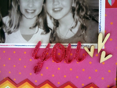
I was inspired by yet another great design of my daughter and her BFF's Jordyn and Lauren.

Margaret Everton an architectural designer says that the Rule of Three is a powerful one:

 "The basic idea of the rule: information and objects that appear in threes are more appealing, memorable, and effective than other numbers of objects. Think three-act plays. Religious triptychs. The three kittens who lost their mittens. Beginning, middle, end. Liberte, egalite, fraternite. Go, fight, win. You get the picture."

Here's my design to inspire you to use the POWER OF THREE on your art work.

I used three different washi tapes and there are three clouds!
I used three journalling strips too.

I also used three little wooden hearts!
But if you look closely you'll also see:

-3 BFF's
-3 different threads
- 3 different pen colours.

So, I challenge you to use the power of three and head over to the Two Scrapbook Friends forum and be challenged by this challenge and many other great ideas to get your creativity jump-started.

Until next time, keep doing what you love to do!